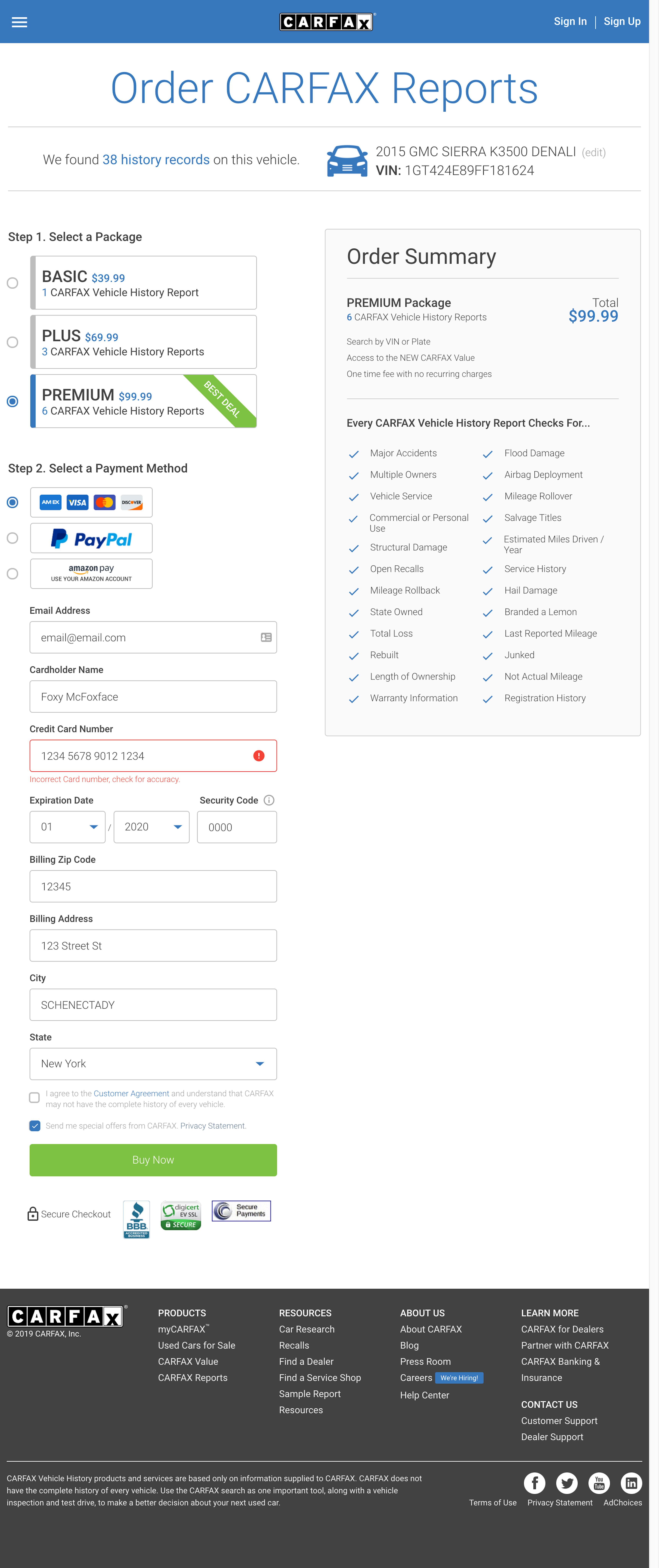
You can click the buttons below to view some screenshots of the site, as well as get more details on the project. Or you can visit the site itself by clicking here: View Site
Tools: Sass, ES5/6, jQuery, Java, and RESTful API consumption.
Task: Execute a major overhaul of the look and feel of Carfax's purchase page in order to increase revenue and conversion.
Challenges: How to add in an entire other page into an existing site while keeping duplicate code to a minimum?
Results: A failure! Surprisingly, this site actually slightly lowered revenue during A/B testing, and was therefore not launched.
Comments: The payment page is a very large Java code base that has been around for years. It uses Java, Springboot, HTML, CSS, Sass, and Javascript. We did not have the time budget to completely rebuild the site, so we had to build on top of it. Pulling off this redesign was a first class lesson in code organization, especially the CSS/Sass and Javascript/jQuery. I'm still very proud of my CSS work on this in particular. But it wasn't meant to be; slightly decreased revenue led to this project being declared a failure.
Team Members: Erik Luetkehans and Amru Samman (designer)
Samples:

